
| 일 | 월 | 화 | 수 | 목 | 금 | 토 |
|---|---|---|---|---|---|---|
| 1 | 2 | 3 | 4 | 5 | ||
| 6 | 7 | 8 | 9 | 10 | 11 | 12 |
| 13 | 14 | 15 | 16 | 17 | 18 | 19 |
| 20 | 21 | 22 | 23 | 24 | 25 | 26 |
| 27 | 28 | 29 | 30 |
- 안드로이드
- Dialog
- Coroutines
- TEST
- data
- 계측
- activity
- Navigation
- appbar
- DART
- Kotlin
- textfield
- 테스트
- Button
- intent
- 앱바
- textview
- Compose
- scroll
- tabbar
- binding
- ScrollView
- android
- viewmodel
- CustomScrollView
- drift
- 앱
- livedata
- LifeCycle
- Flutter
- Today
- Total
Study Record
[Android] Compose 애니메이션 효과 본문
Jetpack Compose 에서는 앱 UI에서 다양한 애니메이션을 쉽게 구현하도록 지원하는 강력하고 확장 가능한 API 를 제공한다.
😶 AnimatedVisibility 컴포저블
콘텐츠 나타남과 사라짐에 대한 애니메이션을 처리할 수 있다. 기본적인 사용 방법은 visible 가 true 이면 나타나고 false 이면 사라진다. enter 매개변수에는 나타날 때 보여질 애니메이션 효과(EnterTransition)를 exit 매개변수에는 사라질 때 보여질 애니메이션 효과(ExitTransition)을 설정할 수 있다.
var editable by remember { mutableStateOf(true) }
AnimatedVisibility(
    visible = editable,
    enter = fadeIn(),
    exit = fadeOut()
) {
    Text(text = "Edit")
}
애니메이션 효과인 EnterTransition 과 ExitTransition 의 종류는 다음 사이트에서 볼 수 있다.
애니메이션 | Jetpack Compose | Android Developers
애니메이션 컬렉션을 사용해 정리하기 내 환경설정을 기준으로 콘텐츠를 저장하고 분류하세요. Jetpack Compose에서는 앱 UI에서 다양한 애니메이션을 쉽게 구현하도록 지원하는 강력하고 확장 가
developer.android.com
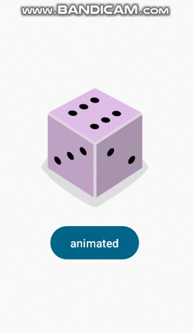
애니메이션 효과를 결합하여 사용할 수 있는데 간단하게 + 기호로 엮으면 된다.
@Composable
fun AnimationScreen() {
    var visible by remember { mutableStateOf(true) }
    Column(
        modifier = Modifier
            .fillMaxSize(),
        verticalArrangement = Arrangement.Center,
        horizontalAlignment = Alignment.CenterHorizontally
    ) {
        AnimatedVisibility(
            visible = visible,
            enter = expandIn() + fadeIn(),
            exit = shrinkOut() + fadeOut()
        ) {
            Image(
                painter = painterResource(id = R.drawable.dice_6),
                contentDescription = null,
                contentScale = ContentScale.Crop,
                modifier = Modifier
                    .clip(RoundedCornerShape(50.dp))
                    .width(150.dp)
                    .aspectRatio(1F)
            )
        }
        Spacer(modifier = Modifier.height(16.dp))
        Button(onClick = { visible = !visible }) {
            Text(text = "animated")
        }
    }
}
색상과 같이 변경하기
AnimatedVisibility 콘텐츠 람다 내의 transition 속성을 통해 나타남, 사라짐 애니메이션 외의 효과를 줄 수 있다. 그 중 애니멘이션이 보여질 때는 Blue 를 보여주고 나머지는 Gray 를 보여주게 할 수 있다.
AnimatedVisibility(
    visible = visible,
    enter = fadeIn(),
    exit = fadeOut()
) { // this: AnimatedVisibilityScope
    // Use AnimatedVisibilityScope#transition to add a custom animation
    // to the AnimatedVisibility.
    val background by transition.animateColor { state ->
        if (state == EnterExitState.Visible) Color.Blue else Color.Gray
    }
    Box(modifier = Modifier.size(128.dp).background(background))
}
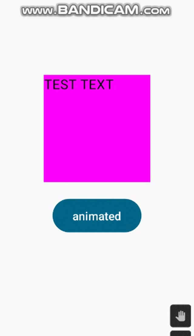
😶 animate*AsState
animate*AsState 함수는 Compose 에서 단일 애니메이션을 처리하는 가장 간단한 Animation API 이다. 다음 에시처럼 animateColorAsState 혹은 animateFloatAsState 등 상태(State)에 따라 지원하는 형식 내에 지정된 값으로 애니메이션을 시작한다. 이 예시에서는 상태(State)가 visible 변수이며 이 변수의 값에 따라 animateColorAsState 는 색상 값이 바뀌고 animateFloatAsState 는 Float 값이 바뀐다.
@Composable
fun AnimationScreen() {
    var visible by remember { mutableStateOf(true) }
    val color by animateColorAsState(
        targetValue = if(visible) Color.Magenta else Color.LightGray
    )
    val alpha: Float by animateFloatAsState(
        targetValue = if(visible) 1F else 0.5F
    )
    Column(
        modifier = Modifier
            .fillMaxSize(),
        verticalArrangement = Arrangement.Center,
        horizontalAlignment = Alignment.CenterHorizontally
    ) {
        Box(
            modifier = Modifier
                .size(128.dp)
                .background(color)
                .graphicsLayer(alpha = alpha)
        ) {
            Text(text = "TEST TEXT" , color = Color.Black)
        }
        Spacer(modifier = Modifier.height(16.dp))
        Button(onClick = { visible = !visible }) {
            Text(text = "animated")
        }
    }
}
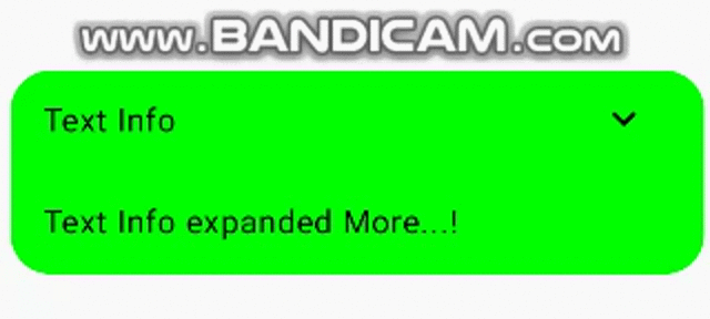
😶 animateContentSize
animateContentSize 수정자는 크기를 변경하는 애니메이션을 표시할 수 있다. 예를 들어, 상세 설명 아이콘에 따라 상세 설명 UI 를 보여주거나 사라지는 기능이 있을 때 상위 컴포저블의 사이즈가 상세 설명 UI 를 포함/미포함에 의해 유기적으로 변할 때 자연스러운 애니메이션 효과를 넣을 수 있다.
@Composable
fun AnimationItem(
    modifier: Modifier = Modifier
) {
    var visible by remember { mutableStateOf(true) }
    Column(
        modifier = modifier
            .animateContentSize()
            .clip(RoundedCornerShape(20.dp))
            .background(Color.Green)
    ) {
        Row(
            verticalAlignment = Alignment.CenterVertically,
            modifier = Modifier.padding(horizontal = 16.dp)
        ){
            Text(text = "Text Info")
            Spacer(modifier = Modifier.weight(1F))
            IconButton(onClick = { visible = !visible }) {
                Icon(
                    imageVector = if(visible) Icons.Filled.ExpandMore else Icons.Filled.ExpandLess,
                    contentDescription = null
                )
            }
        }
        if(visible) {
            Box(
                modifier = Modifier
                    .padding(16.dp)
                    .wrapContentSize()
            ){
                Text(text = "Text Info expanded More...!")
            }
        }
    }
}
애니메이션 | Jetpack Compose | Android Developers
애니메이션 컬렉션을 사용해 정리하기 내 환경설정을 기준으로 콘텐츠를 저장하고 분류하세요. Jetpack Compose에서는 앱 UI에서 다양한 애니메이션을 쉽게 구현하도록 지원하는 강력하고 확장 가
developer.android.com
'안드로이드 > compose' 카테고리의 다른 글
| [Android] Compose 단위 테스트 (0) | 2023.09.13 |
|---|---|
| [Android] Compose ViewModel (0) | 2023.09.13 |
| [Android] Compose Appbar (0) | 2023.09.04 |
| [Android] Compose 테마 (0) | 2023.09.04 |
| [Android] 계측 테스트 - Compose (0) | 2023.08.31 |


