
- 분류 전체보기 (393)

| 일 | 월 | 화 | 수 | 목 | 금 | 토 |
|---|---|---|---|---|---|---|
| 1 | 2 | 3 | 4 | 5 | ||
| 6 | 7 | 8 | 9 | 10 | 11 | 12 |
| 13 | 14 | 15 | 16 | 17 | 18 | 19 |
| 20 | 21 | 22 | 23 | 24 | 25 | 26 |
| 27 | 28 | 29 | 30 |
- 테스트
- 앱바
- textfield
- tabbar
- Compose
- textview
- Coroutines
- livedata
- Button
- Dialog
- CustomScrollView
- data
- 계측
- 안드로이드
- viewmodel
- android
- TEST
- ScrollView
- Kotlin
- LifeCycle
- activity
- scroll
- 앱
- intent
- appbar
- binding
- drift
- Flutter
- Navigation
- DART
- Today
- Total
Study Record
[Flutter] Button 만들기 (TextButton, ElevatedButton, OutlinedButton) 본문
✍ Button 만들기
Text Button을 만들 수 있는 방법은 여러 가지가 있겠지만 3가지를 소개하자면 TextButton, ElevatedButton, OutlinedButton 이 있다. 이 3개의 위젯 모두 설정할 수 있는 인자들이 같다. 또한 각각 서로의 위젯을 만들 수 있다. (Ex. TextButton으로 ElevatedButton을 만들거나 OutlinedButton으로 ElevatedButton을 만들 수 있다.)
서로가 서로의 위젯을 똑같이 만들 수 있는데 하나의 클래스로 존재하지 않고 따로 존재하는 건 그 쓰임의 용도를 다르게 하기 위해서다. 따라서 사용할 때 각각의 쓰임에 맞는 위젯을 사용하는 것이 좋다.
ElevatedButton({
  Key? key,
  required void Function()? onPressed,
  void Function()? onLongPress,
  void Function(bool)? onHover,
  void Function(bool)? onFocusChange,
  ButtonStyle? style,
  FocusNode? focusNode,
  bool autofocus = false,
  Clip clipBehavior = Clip.none,
  MaterialStatesController? statesController,
  required Widget? child
})
필수 인자인 child 에 Text() 위젯을 넣고 onPressed에 클릭 이벤트를 설정하는 것이 기본이다.
ElevatedButton(
  onPressed: () {
    print("onPressed");
  },
  child: const Text("ElevatedButton"),
)
가장 기본적인 것들만 넣고 실행하면 다음과 같은 결과를 얻는다.
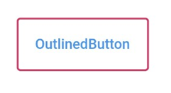
ElevatedButton 은 3D 모양으로 생겼고 OutlinedButton 은 테두리와 색상을 강조하는 모습이다. TextButton 은 평범하게 바탕색과 직사각형 버튼 모습을 하고 있다. 각각의 버튼 모양을 좀 더 꾸미고 싶다면 style 인자를 바꿔주면 된다.
✍ ElevatedButton 꾸미기
(ButtonStyle) style 인자를 통해 버튼을 꾸밀 수 있다. Buttonstyle을 직접 사용해도 되지만 좀 더 쉽게 ElevatedButton.styleFrom()을 통해서도 가능하다.
ElevatedButton.styleFrom();

ButtonStyle styleFrom({
    Color? foregroundColor,
    Color? backgroundColor,
    Color? disabledForegroundColor,
    Color? disabledBackgroundColor,
    Color? shadowColor,
    Color? surfaceTintColor,
    double? elevation,
    TextStyle? textStyle,
    EdgeInsetsGeometry? padding,
    Size? minimumSize,
    Size? fixedSize,
    Size? maximumSize,
    BorderSide? side,
    OutlinedBorder? shape,
    MouseCursor? enabledMouseCursor,
    MouseCursor? disabledMouseCursor,
    VisualDensity? visualDensity,
    MaterialTapTargetSize? tapTargetSize,
    Duration? animationDuration,
    bool? enableFeedback,
    AlignmentGeometry? alignment,
    InteractiveInkFeatureFactory? splashFactory,
  });
1. 버튼 바탕 색상 (backgroundColor, foregroundColor, disabledForegroundColor, disabledBackgroundColor)
onPressed 가 null 이면 disabled 상태이고 null 이 아니면 enabled 상태가 된다.
ElevatedButton(
  onPressed: () {},
  child: const Text("ElevatedButton"),
  style: ElevatedButton.styleFrom(
    backgroundColor: Colors.pink,
    foregroundColor: Colors.lightBlue
  ),
)
enabled 상태에서 backgroundColor 은 말 그대로 바탕 색상을 의미하고 foregroundColor 는 버튼을 누르면 눌렀던 그 위치에서 애니메이션 효과가 발생하는데 그 번지는 효과의 색상과 Text()의 색상을 결정한다. 다만, Text()의 style 속성에 글자 색상을 설정했으면 foregroundColor는 무시되고 Text()의 색상이 채택된다.
ElevatedButton(
  onPressed: null,
  child: const Text("ElevatedButton"),
  style: ElevatedButton.styleFrom(
    disabledBackgroundColor: Colors.pink,
    disabledForegroundColor: Colors.yellow
  ),
)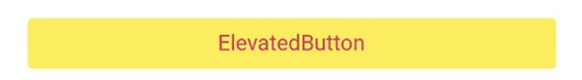
disabled 상태에서 disabledBackgroundColor 는 바탕 색상을 의미하고 disabledFroegroundColor는 Text()의 색상이 지정되어있지 않다면 글자색을 의미한다. (disabled는 클릭 불가능)
2. 그림자(elevation, shadowColor)
ElevatedButton(
  onPressed: (){},
  child: const Text("ElevatedButton"),
  style: ElevatedButton.styleFrom(
    shadowColor: Colors.red,
    elevation: 10.0
  ),
)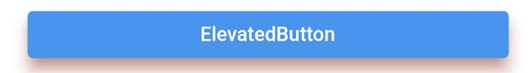
elevation 은 그림자 두께를 뜻하고 shadowColor 는 그림자 색상을 의미한다.
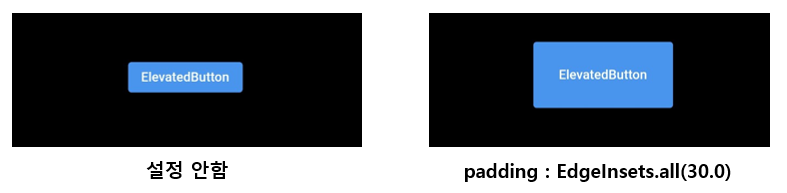
3. 간격(padding)
padding 은 위젯 끝에서 child 사이의 간격을 결정한다.
ElevatedButton(
  onPressed: (){},
  child: const Text("ElevatedButton"),
  style: ElevatedButton.styleFrom(
    padding: EdgeInsets.all(30.0),
  ),
)
4. 사이즈(minimumSize, maximumSize)
- minimumSize: Size(double width, double height) = 위젯의 최소 높이, 너비를 설정한다.
- maximumSize : Size(double width, double height) = 위젯의 최대 높이, 너비를 설정한다.
ElevatedButton(
  onPressed: (){},
  child: const Text("ElevatedButton"),
  style: ElevatedButton.styleFrom(
    minimumSize: Size(200.0, 70.0),
  ),
)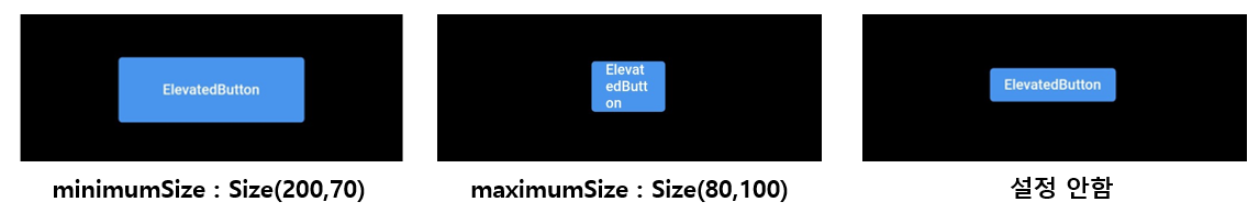
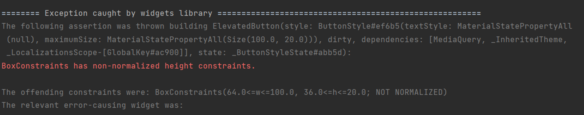
+ 주의해야할 점이 있다면 maximumSize를 너무 작게 적용하면 다음과 같은 오류가 나올 수 있다. width 값과 height 값을 넉넉하게 주면 오류를 해결할 수 있다.
5. border(BorderSide? side, OutlineBorder? shape)
가장자리 border 를 어떻게 할지 설정한다.
5-1. side (BorderSide)
가장자리를 설정할 수 있다.
BorderSide({
  Color color = const Color(0xFF000000),
  double width = 1.0,
  BorderStyle style = BorderStyle.solid,
  StrokeAlign strokeAlign = StrokeAlign.inside,
})
color는 가장자리 색상이고 width는 두께라는 걸 짐작할 수 있다.
style 은 BorderStyle.solid 와 BorderStyle.none 이 있는데 none 은 가장자리를 설정하지 않고 solid는 선 형태로 가장자리를 설정한다는 의미로 봐도 무방하다.
strokeAlign 은 여러가지 설정값이 있는데 예시와 함께 설명하자면 다음과 같다.
ElevatedButton(
  onPressed: (){},
  child: const Text("ElevatedButton"),
  style: ElevatedButton.styleFrom(
    padding: EdgeInsets.all(20.0),
    side: BorderSide(
      color: Colors.black,
      width: 10.0,
      strokeAlign: StrokeAlign.center
    ),
  ),
)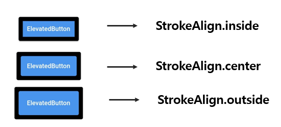
다른 조건은 모두 같고 strokeAlign 인자만 다른 값으로 설정했을 때 위의 그림과 같은 결과를 얻을 수 있다. border 선이 어디에 그려질지가 다른데, inside는 위젯 안에서 border를 그리고 center는 위젯에 반만 걸치게 outside는 위젯 밖에 가장자리가 그려진다.
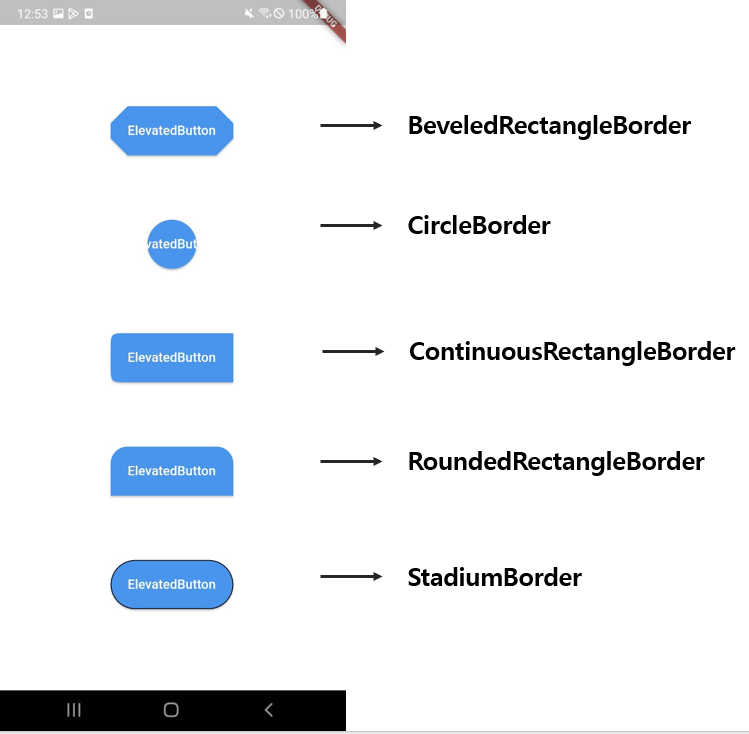
5-2. OutlineBorder shape = RoundedRectangleBorder(borderRadius: BorderRadius.circular(4))
가장자리를 어떤 모양으로 할지 정할 수 있다. Flutter 에서 제공하는 OutlineBorder 중 몇개만 소개해 보면 다음과 같다.
- BeveledRectangleBorder({BorderSide side = BorderSide.none, BorderRadiusGeometry borderRadius = BorderRadius.zero}) : 평평하거나 "원형" 모서리가 있는 직사각형 가장자리를 만들 수 있다.
- CircleBorder({BorderSide side = BorderSide.none, double eccentricity = 0.0}) : 둥근 가장자리를 만들 수 있다.
- ContinuousRectangleBorder({BorderSide side = BorderSide.none, BorderRadiusGeometry borderRadius = BorderRadius.zero}) : RoundedRectangleBorder와 비슷하며, 직선 면과 둥근 모서리 사이의 부드러운 연속적인 전환이 있는 직사각형 가장자리를 만들 수 있다.
- RoundedRectangleBorder({BorderSide side = BorderSide.none, BorderRadiusGeometry borderRadius = BorderRadius.zero}) : 코너가 둥근 직사각형 가장자리를 만들 수 있다.
- StadiumBorder({BorderSide side = BorderSide.none}) : 스타디움같은 가장자리를 만들 수 있다.
공통으로 들어가있는 BorderSide는 5-1에서 설명했던 것과 같다. 상위 위젯의 side 가 우선된다. (ex. ElevatedButton의 side 가 존재하면 RoundedRectangleBorder의 side는 무시된다.)
공통으로 들어가있는 borderRadius는 둥근 정도를 설정하는 인자로 값을 지정하는 방식은 다음과 같다.
// 네 모서리 값을 한번에 정한다.
BorderRadius.circular(double radius)
// Ex) BorderRadius.circular(20.0)


// 네 모서리마다 둥근 정도를 다르게 줄 수 있다.
BorderRadius.only({
  Radius topLeft = Radius.zero,
  Radius topRight = Radius.zero,
  Radius bottomLeft = Radius.zero,
  Radius bottomRight = Radius.zero,
})
// Ex) BorderRadius.only(topLeft: Radius.circular(20.0), bottomright: Radius.circular(10.0))


// left(topLeft, BottomLeft) 와 right(topRight, bottomRight) 를 한꺼번에 값을 줄 수 있다.
BorderRadius.horizontal({
  Radius left = Radius.zero,
  Radius right = Radius.zero
})
// Ex) BorderRadius.horizontal(left: Radius.circular(20.0))


// top(topLeft, topRight) 와 bottom(bottomLeft, bottomRight) 를 한꺼번에 값을 줄 수 있다.
BorderRadius.vertical({
  Radius top = Radius.zero,
  Radius bottom = Radius.zero
})
// Ex) BorderRadius.vertical(top: Radius.circular(20.0))
예시)
...
child: Column(
  mainAxisAlignment: MainAxisAlignment.spaceEvenly,
  children: [
    ElevatedButton(
      onPressed: (){},
      child: const Text("ElevatedButton"),
      style: ElevatedButton.styleFrom(
        padding: EdgeInsets.all(20.0),
        shape: BeveledRectangleBorder(borderRadius: BorderRadius.circular(20.0))
      ),
    ),
    ElevatedButton(
      ...
      style: ElevatedButton.styleFrom(
        padding: EdgeInsets.all(20.0),
        shape: CircleBorder()
      ),
    ),
    ElevatedButton(
      ...
      style: ElevatedButton.styleFrom(
        padding: EdgeInsets.all(20.0),
        shape: ContinuousRectangleBorder(borderRadius:
          BorderRadius.only(
            topLeft: Radius.circular(20.0), bottomLeft: Radius.circular(20.0)
        ))
      ),
    ),
    ElevatedButton(
      ...
      style: ElevatedButton.styleFrom(
          padding: EdgeInsets.all(20.0),
          shape: RoundedRectangleBorder(
            borderRadius: BorderRadius.vertical(top: Radius.circular(20.0)
          ))
      ),
    ),
    ElevatedButton(
      ...
      style: ElevatedButton.styleFrom(
        padding: EdgeInsets.all(20.0),
        side: BorderSide(
            color: Colors.black,
            width: 1.0,
      	),
        shape: StadiumBorder(side: BorderSide(
            color: Colors.pink,
            width: 3.0
          ))
      ),
    ),
  ],
...
✍ OutlinedButton, TextButton 꾸미기
ElevatedButton과 인자가 동일하다.
예시)
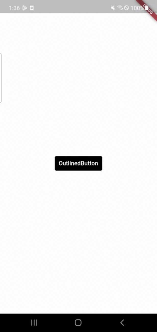
OutlinedButton(
  onPressed: () {},
  child: Text("OutlinedButton"),
  style: OutlinedButton.styleFrom(
    padding: EdgeInsets.all(20.0),
    side: BorderSide(
      color: Colors.pink,
      width: 2.0
    )
  ),
)
TextButton(
  onPressed: () {},
  child: Text("OutlinedButton"),
  style: TextButton.styleFrom(
      padding: EdgeInsets.all(20.0),
      side: BorderSide(
      color: Colors.pink,
      width: 2.0
    )
  ),
)
OutlinedButton와 TextButton 모두 동일한 인자를 가지도록 했다. style의 TextButton.styleFrom()과 OutlinedButton.styleFrom()가 다르지만 결과는 동일하게 나온다. TextButton에 OutlinedButton.styleFrom()를 사용해도 되지만 이상하게 작동할 때가 있으니 이름을 맞춰주는 것이 좋다.
✍ ButtonStyle
TextButton, OutlinedButton, ElevatedButton 의 style 인자는 데이터 타입이 ButtonStyle로 되어있다. 직접 ButtonStyle()을 선언하여 사용해도 되지만 조금 더 쉽게 접근할 수 있도록 제공해 준 것이 OutlinedButton.styleFrom()과 같은 각 버튼의 styleFrom() 함수이다. 직접 ButtonStyle을 제어하는 전에 알아야 할 개념이 있는데 Flutter에서 사용되는 Material State 이다.
※ Material State
- hovered : 호버링 상태 (마우스 커서를 올려놓은 상태)
- focused : 포커스 됐을 때 (텍스트 필드)
- pressed : 눌렸을 때
- dragged : 드래그 됐을 때
- selected : 선택됐을 때 (체크박스, 라디오 버튼)
- scrollUnder : 다른 컴포넌트 밑으로 스크롤링 됐을 때
- disabled : 비활성화 됐을 때 ex. ElevatedButton에 onPressed: null 이면 비활성화 상태
- error : 에러 상태
앱을 만들 때는 호버링 상태는 고려하지 않아도 된다. ButtonStyle는 이런 Material State에 따라 값을 적용할 수 있다. 좀 더 섬세한 컨트롤이 가능하다.
BottonStyle에서 적용할 수 있는 인자들은 다음과 같다.
ButtonStyle({
  MaterialStateProperty ? textStyle,
  MaterialStateProperty ? backgroundColor,
  MaterialStateProperty ? foregroundColor,
  MaterialStateProperty ? overlayColor,
  MaterialStateProperty ? shadowColor,
  MaterialStateProperty ? surfaceTintColor,
  MaterialStateProperty ? elevation,
  MaterialStateProperty ? padding,
  MaterialStateProperty ? minimumSize,
  MaterialStateProperty ? fixedSize,
  MaterialStateProperty ? maximumSize,
  MaterialStateProperty ? side,
  MaterialStateProperty ? shape,
  MaterialStateProperty ? mouseCursor,
  VisualDensity? visualDensity,
  MaterialTapTargetSize? tapTargetSize,
  Duration? animationDuration,
  bool? enableFeedback,
  AlignmentGeometry? alignment,
  InteractiveInkFeatureFactory? splashFactory,
})
인자들은 위에서 알아본 것들과 비슷하다. 여기서 MaterialStateProperty를 모두 필요로 하는 것을 볼 수 있는데 위에서 설명했던 Material State에 따라 각각 다르게 값을 지정할 수 있다.
+ MaterialStateProperty 적용 방법
// 모든 Material State 상태들에 대해 동일한 값을 적용한다.
MaterialStateProperty.all(T value)

// resolveWith()는 상태를 인자로 받는 이벤트에서 각 상태에 대한 값을 다르게 리턴해주면 된다.
// 예시) backgroundColor 를 설정하는 경우
MaterialStateProperty.resolveWith((states){
    if(states == MaterialState.pressed) {
      // 눌렀을 경우
      return Colors.pink;
    }
    // 그 외의 경우
    return Colors.black;
})
예시)
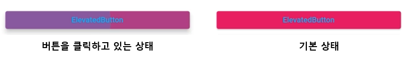
TextButton(
  onPressed: () {},
  style: ButtonStyle(
  	backgroundColor: MaterialStateProperty.resolveWith((states) {
        if (states.contains(MaterialState.pressed)) {
          return Colors.pink;
        }
        return Colors.black;
  	}),
  	padding: MaterialStateProperty.resolveWith((states) {
        if (states.contains(MaterialState.pressed)) {
          return EdgeInsets.all(30.0);
        }
        return EdgeInsets.all(10.0);
    }),
  ),
  child: const Text("OutlinedButton", style: TextStyle(color: Colors.white),),
)
'Flutter' 카테고리의 다른 글
| [Flutter] 그라데이션 효과와 BoxDecoration (0) | 2023.02.13 |
|---|---|
| [Flutter] 화면 전환하기 (Navigator) (2) | 2023.02.11 |
| [Flutter] const 를 사용하는 이유 (0) | 2023.02.04 |
| [Flutter] theme 적용해보기 - 글꼴 (0) | 2023.02.03 |
| [Flutter/Dart] 날짜 (DateTime class) (0) | 2023.02.01 |


