
- 분류 전체보기 (364)

| 일 | 월 | 화 | 수 | 목 | 금 | 토 |
|---|---|---|---|---|---|---|
| 1 | ||||||
| 2 | 3 | 4 | 5 | 6 | 7 | 8 |
| 9 | 10 | 11 | 12 | 13 | 14 | 15 |
| 16 | 17 | 18 | 19 | 20 | 21 | 22 |
| 23 | 24 | 25 | 26 | 27 | 28 |
- Navigation
- appbar
- activity
- 테스트
- LifeCycle
- Compose
- scroll
- textfield
- Coroutines
- 계측
- android
- tabbar
- binding
- Flutter
- Kotlin
- ScrollView
- 앱바
- data
- DART
- CustomScrollView
- 안드로이드
- 앱
- Dialog
- TEST
- Button
- viewmodel
- intent
- drift
- textview
- livedata
- Today
- Total
Study Record
[Flutter] 앱바 (appbar) 본문
🎁 Appbar
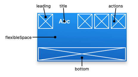
플러터에서 앱바 기능을 해주는 위젯은 Appbar() 위젯이다. Scaffold() 의 appbar 인자로 사용할 수 있다. flutter api 공식 문서에 나와있는 것을 참고하면 앱바의 주요 부분들을 leading, title, actions ... 으로 불린다.
😶 간단한 앱바

Scaffold(
appBar: AppBar(
leading: Align(
alignment: Alignment.centerLeft,
child: IconButton(
onPressed: () {
print("leading press");
},
icon: Icon(Icons.arrow_back_rounded, color: Colors.black,),
),
),
leadingWidth: 80.0,
titleSpacing: 0.0,
title: Text("Appbar"),
backgroundColor: Colors.pinkAccent,
foregroundColor: Colors.purple,
elevation: 0.0,
centerTitle: false,
actions: [
IconButton(
onPressed: () {
print("alarm press");
},
icon: Icon(Icons.access_alarm),
),
IconButton(
onPressed: () {
print("balance press");
},
icon: Icon(Icons.account_balance),
),
],
),
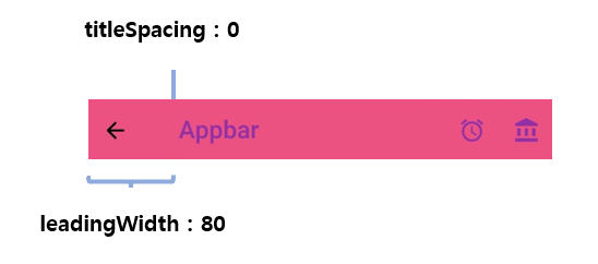
);leading 과 title, actions 인자로 설명했던 대로 각 위젯을 배치하고 leadingWidth 로 leading 위젯의 크기를 설정했다. titleSpacing 값은 leading 위젯이 차지하는 공간과 title 위젯의 horizontal 간격을 의미한다. centerTitle 을 true 로 하면 title로 설정된 위젯이 leading 과 actions 사이의 가운데로 위치한다.
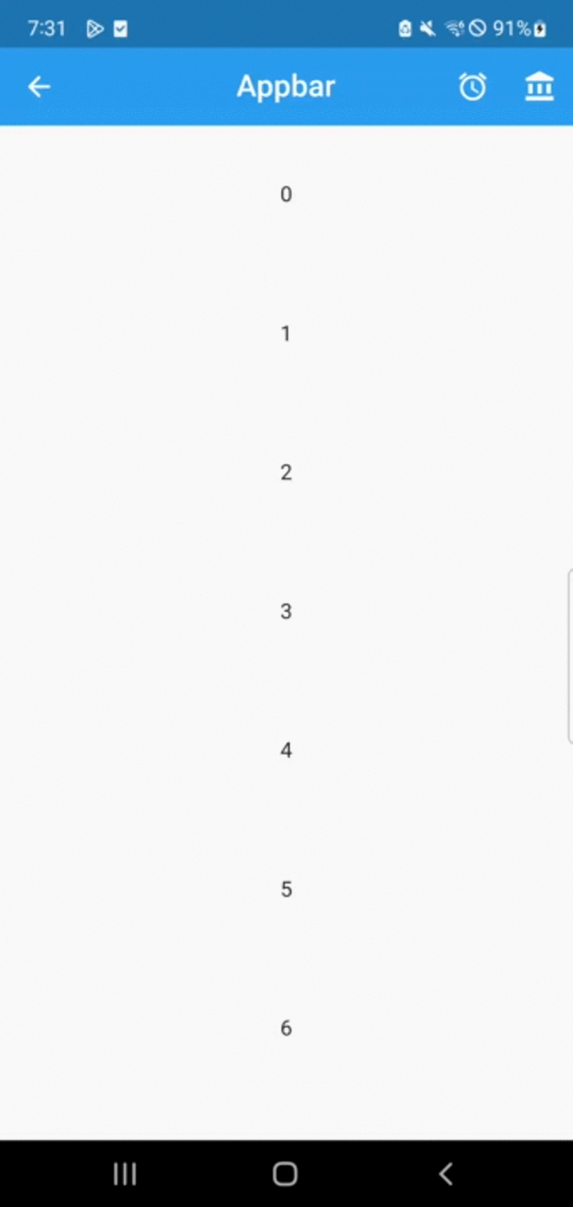
background 는 appbar 의 바탕색을 정하고 foregroundColor 는 Text 위젯과 Icon 위젯의 기본 색상이 된다. Text와 Icon 색상 값이 따로 정해지지 않으면 foregroundColor 가 된다. 따라서 예시의 Text 위젯과 색상이 정해지지 않은 Icon 들의 색상이 전부 foregroundColor(보라색) 로 설정된 것을 볼 수 있다.
😶 Elevation
elevation 효과는 elevation 인자로 줄 수 있다. 만약 스크롤 가능한 화면이고 스크롤이 되어있는 동안에는 elevation 값을 다르게 주고 싶다면 간단하게 scrolledUnderElevation 인자로 설정해주면 된다.
예시)
import 'package:flutter/material.dart';

void main() => runApp(MaterialApp(
      home: MyApp(),
      debugShowCheckedModeBanner: false,
    ));

class MyApp extends StatelessWidget {
  const MyApp({Key? key}) : super(key: key);

  @override
  Widget build(BuildContext context) {
    return Scaffold(
      appBar: AppBar(
        leading: IconButton(
          onPressed: () {},
          icon: Icon(Icons.arrow_back_rounded),
        ),
        title: Text("Appbar"),
        elevation: 0.0,
        scrolledUnderElevation: 10.0,
        centerTitle: true,
        actions: [
          IconButton(
            onPressed: () {},
            icon: Icon(Icons.access_alarm),
          ),
          IconButton(
            onPressed: () {},
            icon: Icon(Icons.account_balance),
          ),
        ],
      ),
      body: ListView.builder(
        itemCount: 20,
        itemBuilder: (context, index) {
          return Container(
            height: 100,
            width: MediaQuery.of(context).size.width,
            child: Center(child: Text("$index")),
          );
        },
      ),
    );
  }
}
😶 탭이 있는 앱바 만들기
[Flutter] 탭바 기본 만들기 (TabBar, Tab, TabBarView, TabController, DefaultTabController)
✍ 탭바(TabBar) 만들기 탭바를 만드는 방법 중 Appbar 위젯의 bottom 인자를 사용하는 방법을 소개하려 한다. 먼저 TabBar() 위젯의 tabs 인자(List)에 탭 역할을 할 위젯들을 넣는다. 어떤 위젯이든 되지만
laustudy.tistory.com
+ 참고 사이트
AppBar class - material library - Dart API
A Material Design app bar. An app bar consists of a toolbar and potentially other widgets, such as a TabBar and a FlexibleSpaceBar. App bars typically expose one or more common actions with IconButtons which are optionally followed by a PopupMenuButton for
api.flutter.dev
'Flutter > widget' 카테고리의 다른 글
| [Flutter] SafeArea (0) | 2023.04.23 |
|---|---|
| [Flutter] 슬라이드 메뉴(Drawer) (0) | 2023.03.17 |
| [Flutter] focus 해제/요청하기, 키보드 내리기 (TextField) (0) | 2023.02.26 |
| [Flutter] 바텀 시트 (showModalBottomSheet) (0) | 2023.02.23 |
| [Flutter] 하위 항목 자동 줄바꿈 (Wrap Widget) (0) | 2023.02.22 |


