
| 일 | 월 | 화 | 수 | 목 | 금 | 토 |
|---|---|---|---|---|---|---|
| 1 | 2 | 3 | 4 | 5 | 6 | 7 |
| 8 | 9 | 10 | 11 | 12 | 13 | 14 |
| 15 | 16 | 17 | 18 | 19 | 20 | 21 |
| 22 | 23 | 24 | 25 | 26 | 27 | 28 |
- TEST
- 안드로이드
- scroll
- DART
- Dialog
- data
- Coroutines
- Kotlin
- Button
- 앱바
- Compose
- Navigation
- textview
- viewmodel
- 앱
- ScrollView
- 계측
- activity
- LifeCycle
- textfield
- Flutter
- tabbar
- livedata
- drift
- intent
- appbar
- binding
- 테스트
- CustomScrollView
- android
- Today
- Total
Study Record
[Android] Compose 의 텍스트 본문
JetPack Compose 에서 텍스트 표현은 Text() 컴포저블 함수를 사용한다.
@Composable
fun Text(
    text: String,
    modifier: Modifier = Modifier,
    color: Color = Color.Unspecified,
    fontSize: TextUnit = TextUnit.Unspecified,
    fontStyle: FontStyle? = null,
    fontWeight: FontWeight? = null,
    fontFamily: FontFamily? = null,
    letterSpacing: TextUnit = TextUnit.Unspecified,
    textDecoration: TextDecoration? = null,
    textAlign: TextAlign? = null,
    lineHeight: TextUnit = TextUnit.Unspecified,
    overflow: TextOverflow = TextOverflow.Clip,
    softWrap: Boolean = true,
    maxLines: Int = Int.MAX_VALUE,
    minLines: Int = 1,
    onTextLayout: ((TextLayoutResult) -> Unit)? = null,
    style: TextStyle = LocalTextStyle.current
)
표시할 String 타입의 텍스트는 값을 직접 하드코딩된 값으로 설정해도 문제 없지만 StringResource() 함수를 사용하여 문자열 리소스를 사용하는 것이 좋다.
@Composable
fun StringResourceText() {
    Text(stringResource(R.string.hello_world))
}
😶 기본적인 텍스트 스타일 변경하기
Text(
    stringResource(id = R.string.signature_text),
    textAlign = TextAlign.Center,
    fontStyle = FontStyle.Italic,
    fontSize = 24.sp,
    color = colorResource(id = R.color.purple_200)
)
fontSize 로 텍스트의 크기를 설정할 수 있다.
color 로 텍스트의 색상을 설정할 수 있다.
fontStyle 로 텍스트의 스타일을 변경할 수 있는데 FontStyle.Italic 은 기울임꼴로 표시할 수 있다.
textAlign 으로 텍스트를 정렬할 수 있다. TextAlign.Center, TextAlign.Start, TextAlign.End 등으로 값을 가질 수 있다.
😶 최대 라인 수 & 오버플로우
Text(
    "Hello Compose ".repeat(50),
    maxLines = 2,
    overflow = TextOverflow.Ellipsis
)
maxLines 로 표시되는 줄 수를 제한할 수 있다.
overflow 로 긴 텍스트로 인해 잘리게 되는 텍스트를 어떻게 할 건지 설정할 수 있다. TextOverflow.Ellipsis 는 (...) 을 뒤에 표시한다.
Hello Compose Hello Compose Hello Compose Hello Compose Hello Compose Hello Compose Hello Compose Hello Compose Hello Compose Hello Compose Hello Compose Hello Compose Hello Compose ...
😶 글꼴, 텍스트 두께
Text("Hello World", fontFamily = FontFamily.Serif)fontFamily 로 텍스트의 글꼴 설정할 수 있다. 기본적으로 Serif, Sans Serif 등 글꼴을 제공한다.
Font() 함수로 외부에서 다운받은 글꼴을 사용할 수 있다. fontWeight 로 적합한 가중치를 선택할 수 있다.
val firaSansFamily = FontFamily(
        Font(R.font.firasans_light, FontWeight.Light),
        Font(R.font.firasans_regular, FontWeight.Normal),
        Font(R.font.firasans_italic, FontWeight.Normal, FontStyle.Italic),
        Font(R.font.firasans_medium, FontWeight.Medium),
        Font(R.font.firasans_bold, FontWeight.Bold)
)

Column {
    Text(..., fontFamily = firaSansFamily, fontWeight = FontWeight.Light)
    Text(..., fontFamily = firaSansFamily, fontWeight = FontWeight.Normal)
    Text(..., fontFamily = firaSansFamily, fontWeight = FontWeight.Medium)
    Text(..., fontFamily = firaSansFamily, fontWeight = FontWeight.Bold)
}
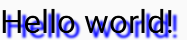
😶 그림자
style 매개변수로 그림자를 구성할 수 있다. Shadow 는 그림자의 색상, 오프셋, 또는 Text 와 관련하여 배치되는 위치, 흐리게 처리되는 정도를 나타내는 블러 반경을 수신할 수 있다.
@Preview(showBackground = true)
@Composable
fun TextShadow() {
    val offset = Offset(5.0f, 10.0f)
    Text(
        text = "Hello world!",
        style = TextStyle(
            fontSize = 24.sp,
            shadow = Shadow(
                color = Color.Blue,
                offset = offset,
                blurRadius = 3f
            )
        )
    )
}
😶 텍스트 내 여러 스타일
동일한 Text 컴포저블 내에서 여러 스타일을 설정하려면 임의의 주석 스타일로 주석을 추가할 수 있는 문자열인 AnnotatedString 을 사용해야 한다. 같은 문자 수준에서 적용하려면 SpanStyle 을 사용한다.
Text(
    buildAnnotatedString {
        withStyle(style = SpanStyle(color = Color.Blue)) {
            append("H")
        }
        append("ello ")
        withStyle(style = SpanStyle(fontWeight = FontWeight.Bold, color = Color.Red)) {
            append("W")
        }
        append("orld")
    },
    fontSize = 24.sp,
    color = Color.Green
)
전체 단락에 적용하려면 ParagraphStyle 를 사용한다.
Text(
    buildAnnotatedString {
        withStyle(style = ParagraphStyle(lineHeight = 30.sp)) {
            withStyle(style = SpanStyle(color = Color.Blue)) {
                append("Hello\n")
            }
            withStyle(
                style = SpanStyle(
                    fontWeight = FontWeight.Bold,
                    color = Color.Red
                )
            ) {
                append("World\n")
            }
            append("Compose")
        }
    }
)
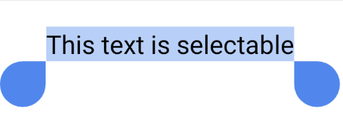
😶 텍스트 선택
기본적으로 컴포저블은 선택할 수 없다. 즉, 텍스트를 선택하고 복사할 수 없다. 따라서 텍스트 선택 기능을 사용하려면 텍스트 요소를 SelectionContainer 컴포저블로 래핑해야 한다.
@Composable
fun SelectableText() {
    SelectionContainer {
        Text("This text is selectable")
    }
}
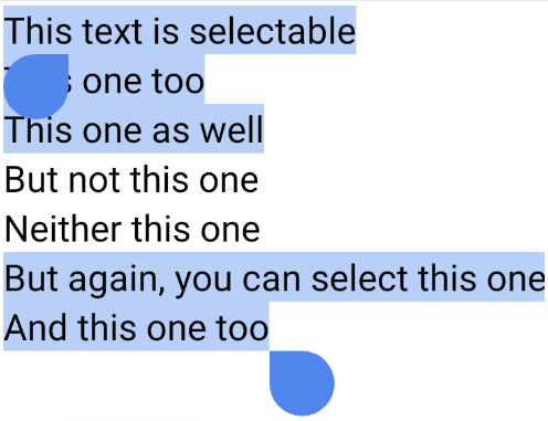
선택 가능한 영역의 특정 부분만 선택 불가능하게 해야한다면 그 부분만 DisableSelection 컴포저블로 래핑한다.
@Composable
fun PartiallySelectableText() {
    SelectionContainer {
        Column {
            Text("This text is selectable")
            Text("This one too")
            Text("This one as well")
            DisableSelection {
                Text("But not this one")
                Text("Neither this one")
            }
            Text("But again, you can select this one")
            Text("And this one too")
        }
    }
}
😶 클릭 위치 가져오기
Text 의 클릭 위치를 가져오고 싶다면 ClickableText 를 사용하면 된다.
@Composable
fun SimpleClickableText() {
    ClickableText(
        text = AnnotatedString("Click Me"),
        onClick = { offset ->
            Log.d("ClickableText", "$offset -th character is clicked.")
        }
    )
}
😶 주석이 추가된 텍스트
특정 단어를 클릭했을 때 단어에 연결된 URL 로 이동해야 할 경우 다음과 같이 구현할 수 있다.
@Composable
fun BasicText() {
    val annotatedText = buildAnnotatedString {
        append("Click ")

        // We attach this *URL* annotation to the following content
        // until `pop()` is called
        pushStringAnnotation(tag = "URL",
            annotation = "https://developer.android.com")
        withStyle(style = SpanStyle(color = Color.Blue,
            fontWeight = FontWeight.Bold)) {
            append("here")
        }

        pop()
        append("!!")
    }

    ClickableText(
        text = annotatedText,
        onClick = { offset ->
            // We check if there is an *URL* annotation attached to the text
            // at the clicked position
            annotatedText.getStringAnnotations(tag = "URL", start = offset,
                end = offset)
                .firstOrNull()?.let { annotation ->
                    // If yes, we log its value
                    Log.d("Clicked URL", annotation.item)
                }
        }
    )
}
Compose의 텍스트 | Jetpack Compose | Android Developers
Compose의 텍스트 컬렉션을 사용해 정리하기 내 환경설정을 기준으로 콘텐츠를 저장하고 분류하세요. 텍스트는 모든 UI의 중심 요소이며 Jetpack Compose를 사용하면 텍스트를 더 쉽게 표시하거나 쓸
developer.android.com
'안드로이드 > compose' 카테고리의 다른 글
| [Android] Compose 기초 (0) | 2023.08.29 |
|---|---|
| [Android] Compose modifier(수정자) (0) | 2023.08.29 |
| [Android] Compose 컴포저블 참고사항 (0) | 2023.08.28 |
| [Android] Compose 참고사항 (0) | 2023.08.25 |
| [Android] Compose 살펴보기(+ 기본 레이아웃 요소) (0) | 2023.08.25 |


